It is a “No Brainer” that employment fuels the housing market,
but just how correlated they are is almost shocking!
It is hard to watch the news now-a-days without hearing about the housing market and the jobs market, but for some reason they always discuss these two markets independently, and rarely discuss the correlation between the two. So I decided to do some digging and share my results with all of you!
I have studied quite a bit about finance and whether through my own hypothesis, or through something I read somewhere, I always believed that employment was a leading indicator of where the housing market was headed. After researching this article, and how the markets reacted after the housing bubble burst, I am no longer certain that changes in employment are that much ahead of changes in the housing market.
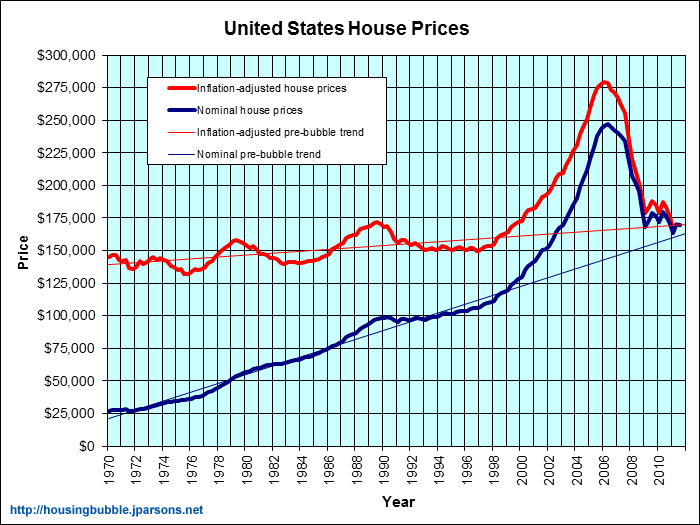
This first graph below illustrates the inflation adjusted and nominal median house prices in the United States.
Let’s take a look:
It doesn’t take a rocket scientist to see the rapid rise and fall in house prices around the nation, and sadly when looking at this graph it is almost pathetic that we didn’t see a problem looming on the horizon when values were shooting up so fast! Take a look at the two additional lines on this graph that represent the pre-bubble value trends… It should have been obvious that something was amiss; but, hindsight is 20/20!
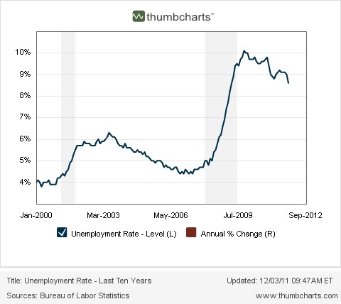
Let us now turn our attention to the other variable in this equation: Employment (or lack there of!)
Again, no rocket scientist necessary. When the bubble burst, the jobs went away seemingly over night and the unemployment rate shot up!
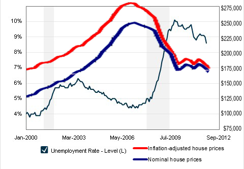
Now that we know how the two markets reacted individually, let’s take a look at correlation between the two; and while it may look like a kid drew this with a crayon, it is to scale and accurate.
Going back to what I said initially, I always believed that employment was a good leading indicator of where the housing market was headed, but this graph suggests otherwise. Looking closely one can see that almost as if they were synchronized swimmers, house prices fell and unemployment rose at the same time. They have almost a perfect inverse correlation, and appear to be completely efficient with no lag time between them.
Once again, it seems that one cannot beat the market!
-JJM
John is the Vice President here at JohnHart, and as such is responsible for managing and directing the firm towards obtaining its ultimate goals.
He is also one of our main contributors on the Blog. (please see his profile page on the main site for more information.)


You completed a number of nice points there. I did a search on the issue and found nearly all people will have the same opinion with your blog.