Featured image credit: monkeytime | brachiator
Architecture is such an important element of real estate that we feel it deserves its own regularly occurring series. Especially the architecture of Southern California with its wealth of diversity. Therefore, we welcome you to the first Los Angeles Architecture 101 blog exploring the structural art of LA.
And we’re starting things out in style (or lack thereof depending on who you ask) with the black sheep of SoCal architecture. It’s called Googie architecture and it’s often regarded as a defining aesthetic of the region. Think the name’s strange? Wait until you see the buildings! This division of futurist architecture owes a debt to technological advances that were going on from the late 1940s through the early ‘60s. The automobile was defining culture. Jet travel was becoming commonplace. A space race was happening. And even looming mushroom clouds hadn’t quite darkened America’s nuclear power craze… yet. Googie architecture captured that optimism in a way that some found exciting and others found tacky. But no one found it boring.
Update – May 2024:
LA Googie architecture staple (oh, and they sell fried chicken too) Dinah’s Family Restaurant has moved. Due to ongoing area developments that would have forced them to close for years, the iconic restaurant relocated operations to Culver City where it reopened on May 6 as Dinah’s Kitchen. But the name and the location aren’t the only updates. Owner Mario Ernst has expanded the menu and is using more locally sourced ingredients. But we’re here to talk about architecture. And though the original Dina’s building may be lost, Ernst has made sure to maintain a Googie design for the Culver City location.
Defining Characteristics of Googie Architecture
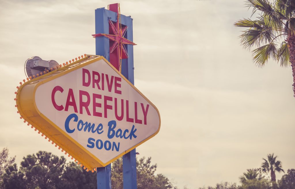
Because of its over-the-top nature, Googie architecture is often easy to recognize. Defining characteristics include:
- Roofs curving upward in dramatic fashion
- Curvilinear contours
- Daring utilization of neon, glass, chrome, and steel
- Retrofuturistic designs (such as atomic symbols, arrows/boomerangs, and starbursts)
- Geometric shapes
- Vibrant color palettes
As you can imagine from that laundry list of qualifiers, no two Googie buildings are exactly alike. Many elements of Googie architecture are purely decorative, serving no other function than to attract passing motorists like a visual siren’s call.
Take for example the starburst punctuating the iconic Las Vegas welcome sign. In it, you’ll clearly see the explosive dynamism and electric thrill at the heart of Googie architecture. It may seem like these outrageous aesthetic quirks are without function. But when Googie architecture first began, there were several reasons.
What Inspired Googie Architecture?
Googie was a direct reflection of the world at that time, or at least a particularly sparkling facet of it. It was almost as if the country were celebrating its technological achievements in solid form. The architectural style was popularized almost exclusively in commercial buildings: coffee shops, gas stations, motels. But these weren’t just any commercial buildings: they were businesses that directly appealed to motorists.
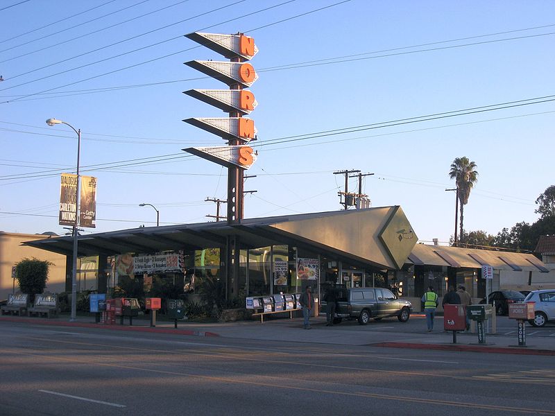
Car culture was in its infancy, but the U.S. was entering an era in which virtually every family owned an automobile. With the rise of car culture, families were taking more distant vacations. Salesmen were traveling more miles. And cities were beginning to expand beyond their downtown hubs.
Up until this point, business and residential districts were segregated. But with car ownership on the rise, businesses began to expand into areas normally reserved for residential use. Business chains began to grow. But how could these businesses stand out from the residential landscape? They needed to appeal to people zooming past in their cars, not leisurely pedestrians.
Enter Googie architecture’s outlandish and dynamic shapes and colors. Neon arrows and looming dramatic angles guided customers to these bold beacons. It was a reconfiguration of marketing philosophy cast in neon, chrome, and steel. The war was over and people wanted to leave it far behind in their rear view mirrors. Car culture, jet setting, and the space race offered a realistic way to move forward… and fast. The future promised by the magazines was here.
What’s With The Name “Googie”?
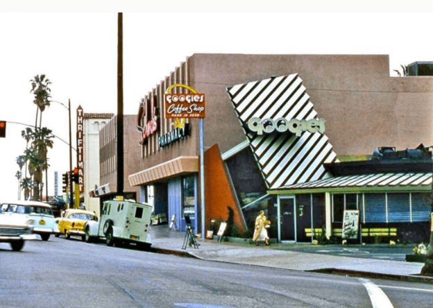
With such quirky architecture, a name as absurd as “Googie” fits. But there’s a method to the madness. In 1949, legendary architect John Lautner was hard at work creating a unique design for a new coffee shop. Yes, that’s the same John Lautner who most recently made appearances in this very blog as the designer behind the Chemosphere and the Bob Hope house. The sharp, dramatic angles of the coffee shop’s roof were a clear indicator of Googie architecture before it had a name. Shop owner Mortimer C. Burton decided to name his restaurant after an affectionate family nickname for his wife Lillian. Little did he know he’d be naming more than a restaurant that day. Soon, the Hollywood-based building erected a glowing neon sign that read “Googies Coffee Shop.”
Who knows what this architecture style would have been called had House and Home magazine editor Douglas Haskell not noticed the coffee shop while passing in his car with photographer Julius Shulman. In 1952, he published a rather unflattering article in which he referred to the movement as “Googie architecture.” The term outlived its namesake when Googie’s Coffee Shop was demolished in 1989. While the Googie name endures, it has also competed with other terms over the years. Googie architecture can also be referred to as Doo Wop or populuxe architecture. However “populuxe” (a portmanteau of popular and luxury) often applies to more than architecture.
Who Was the First Architect to Work in Googie?
While it’s difficult to pinpoint the precise genesis of Googie architecture, the vast majority of experts agree on Southern California as its point of origin. Its roots were in Streamline Moderne architecture, a global take on Art Deco popular in the 1930s and inspired by aerodynamic designs. When Googie architecture became defined enough to be recognized as its own animal, it was still considered a type of Mid-Century Modern design.
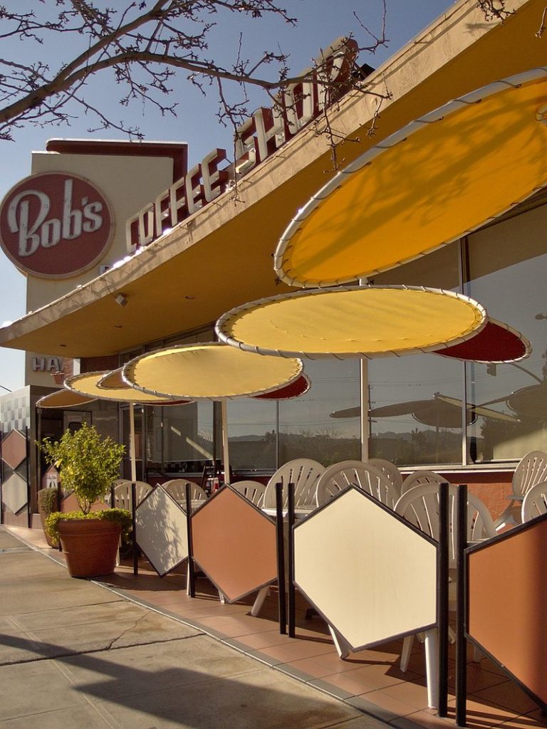
But who was the visionary who first started the Googie architecture movement? Some might be quick to claim John Lautner. After all, he was the designer behind the coffee shop that served as the style’s namesake. Yet, many art historians believe Googie architecture was better exemplified by a design drafted a year later in 1949 by architect Wayne McAllister. The building? A Bob’s Big Boy location in Burbank that still stands today as the chain’s oldest surviving restaurant.
Notable architects and designers who worked in Googie architecture include:
- John Lautner
- Wayne McAllister
- Douglas Honnold
- Louis Armet (of Armet & Davis)
- Eldon Davis (of Armet & Davis)
- Helen Liu Fong (of Armet & Davis)
- Martin Stern, Jr.
- William L. Pereira & Associates
The Decline of Googie
Googie architecture was thrilling and dynamic, but it wasn’t always appreciated. Architecture-enthusiasts regularly heaped criticism on Googie designs, dismissing them as tacky and lacking in substance. This perspective only gained traction as Googie’s retrofuturism aged into the 1970s. The “progress at all costs” pioneering spirit of the 1950s and ‘60s came at a price that the ‘70s weren’t willing to pay.
Thus forward-thinking gazes refocused on ecology and environmental conservation. Greener perspectives were often at odds with technological advances like nuclear power which were facing heightened scrutiny. After the Apollo 11 mission put a man on the moon, the space race took an extended break to catch its breath. The automobile continued to chug onward, but the U.S. was pumping the brakes on its fast track forward. Googie architecture quickly lost its former luster.
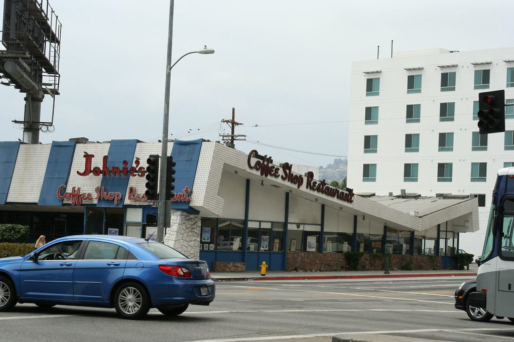
Designs that had been bold, exciting and futuristic now appeared laughably antiquated. The organizations that would normally protect buildings of historical significance found little worth preserving in Googie architecture. With the International Style of the 1930s coming back into fashion in the ‘70s, Googie buildings were demolished without a second thought.
Googie architecture had been almost exclusively relegated to commercial buildings which also lowered their historical significance in the eyes of the architectural community. Soon, the landscape of Southern California had changed to a more uniform look more befitting the time. The Googie motels, gas stations, and restaurants left standing were few and far between.
Examples of Los Angeles Googie Architecture You Can Still See Today
Sadly, that’s where the story of Googie architecture ends. And the chances of a sequel are slim to none. It’s just too expensive to create those dramatic designs. However, Southern California residents can still enjoy some truly iconic examples of Googie architecture that are much more appreciated today than they were in their heyday. This is largely thanks to the Los Angeles Conservancy’s Modern Committee (ModCom). ModCom formed in 1984 in response to the demolition of a couple of LA’s most iconic examples of Googie architecture. These were a Ships Coffee Shop location in Westwood and Tiny Naylor’s Drive-In in Hollywood. ModCom has done much to protect Googie designs across the city with historical designations.
Make your next free sunny weekend afternoon memorable with your own Googie tour. This city itself can be quite the museum if you know where to look! Here are a few places you can start:
- Theme Building – 201 World Way, Los Angeles, CA 90045
- Chips Restaurant – 11908 Hawthorne Blvd, Hawthorne, CA 90250
- Union 76 Gas Station – 427 N Crescent Dr, Beverly Hills, CA 90210
- Pann’s Restaurant – 6710 La Tijera Blvd, Los Angeles, CA 90045
- Driftwood Dairy – 10724 Lower Azusa Rd, El Monte, CA 91731
- Five Points Car Wash – 8016 Santa Fe Springs Rd, Whittier, CA 90606
- NORMS Restaurant – 470 N La Cienega Blvd, West Hollywood, CA 90048
- Safari Inn – 1911 West Olive Ave, Burbank, CA 91506
- The World’s Oldest McDonald’s – 10207 Lakewood Blvd, Downey, CA 90240
- Bob’s Big Boy – 4211 W Riverside Dr, Burbank, CA 91505
With a brand that says as much as JohnHart’s, Senior Copywriter Seth Styles never finds himself at a loss for words. Responsible for maintaining the voice of the company, he spends each day drafting marketing materials, blogs, bios, and agent resources that speak from the company’s collective mind and Hart… errr, heart.
Having spent over a decade in creative roles across a variety of industries, Seth brings with him vast experience in SEO practices, digital marketing, and all manner of professional writing with particular strength in blogging, content creation, and brand building. Gratitude, passion, and sincerity remain core tenets of his unwavering work ethic. The landscape of the industry changes daily, paralleling JohnHart’s efforts to {re}define real estate, but Seth works to maintain the company’s consistent message while offering both agents and clients a new echelon of service.
When not preserving the JohnHart essence in stirring copy, Seth puts his efforts into writing and illustrating an ongoing series entitled The Death of Romance. In addition, he adores spending quality time with his girlfriend and Romeo (his long-haired chihuahua mix), watching ‘70s and ‘80s horror movies, and reading (with a particular penchant for Victorian horror novels and authors Yukio Mishima and Bret Easton Ellis). He also occasionally records music as the vocalist and songwriter for his glam rock band, Peppermint Pumpkin.



Great Article! I would love to share it on Facebook but when I click the Facebook symbol it just takes me to the real estate site, the button that says sharing isn’t a link, and when I click on Seth Styles website it takes me again to the real estate site. Any ideas?
Thanks for the kind words! You can share this post on Facebook by going to the righthand menu bar and scrolling down to the section that reads “Like Our Articles? Share Us On Social Media” (past the “Wondering What Your Home is Worth?” banner, “Visit JohnHart” video, and “Interested in Joining JohnHart” banner). Choose the Facebook icon from the rows of icons in this section and it will lead you through the rest. We appreciate any shares, so thank you!