Amazing homes are not 3D printed, at least not for now. At present, an amazing home is comprised of a lot of little great, and often bold, decisions. If you’re looking to build a home that stands out, stops people in their tracks, and ends up in magazines, you’ve got to go above and beyond – AND you’ve got to push some boundaries.
The list below is not exhaustive, there are plenty of other elements that could be in here, this is simply a collection of some of my favorite design elements that are shaking things up in the design world.
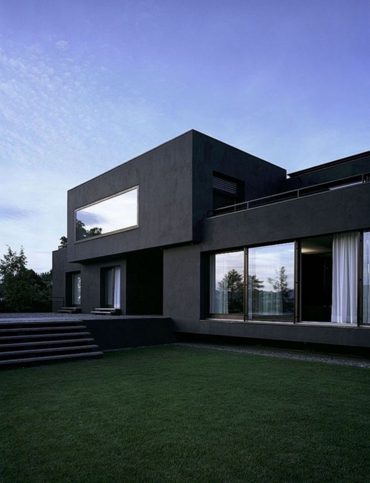
First and foremost, let’s talk about Dark Interiors/Exteriors. Bold and Brave, but when done right it’s a show stopper. Take a look at this living room and tell me you wouldn’t be floored walking into this room!
…or that you wouldn’t be blown away pulling up to someone’s black modern castle like the one below…
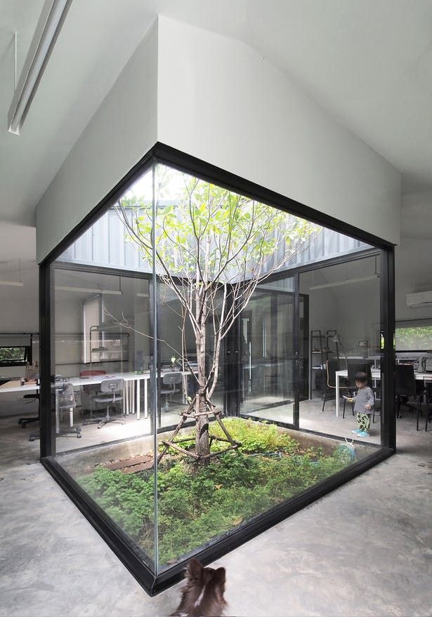
Let’s head inside and talk about a personal favorite of mine: Atriums. Nothing says my mental health and bank account are doing very well like an open air atrium in the middle of your house… #JustSayin
or this one below for our ultra-mod atrium fans…
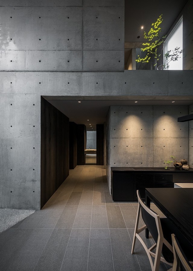
While we’re here let’s talk about Concrete Walls. They’re great. If you’ve ever been to a JohnHart office you know we’re fans of concrete walls and the reason is pretty obvious… They’re great. Please don’t make me repeat myself again.
Here’s a minimalist example of what we’re talking about.
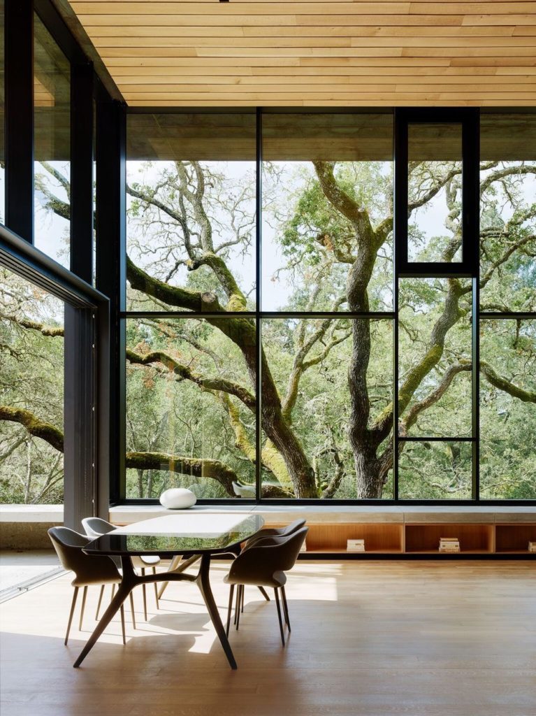
Next up we have Oversized Windows, because what’s the point of living inside if you aren’t bathed in natural light at all times… I mean besides safety and protection and all of those other reasons. Seriously though, look at this window collage wall below.
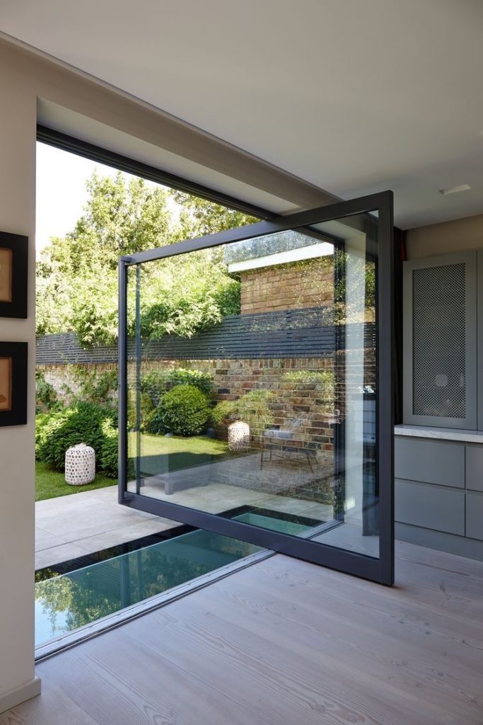
I’ve been wanting to talk about doors since we started this thing, so let’s do that. Doors? Love ’em, they’re great.
Pivot Doors? Even better. They pivot. Check out below… right???
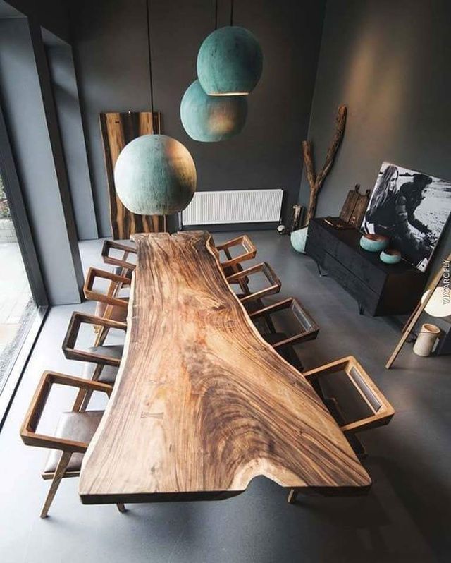
I’m a fan of trees, and I generally prefer them living outside, but if I’m going to have them in my house they’re got to be in the form of a Live Edge Table. Do yourself a favor and google this one, or get on Pinterest because there are some amazing examples out there… if you aren’t convinced by the one below.
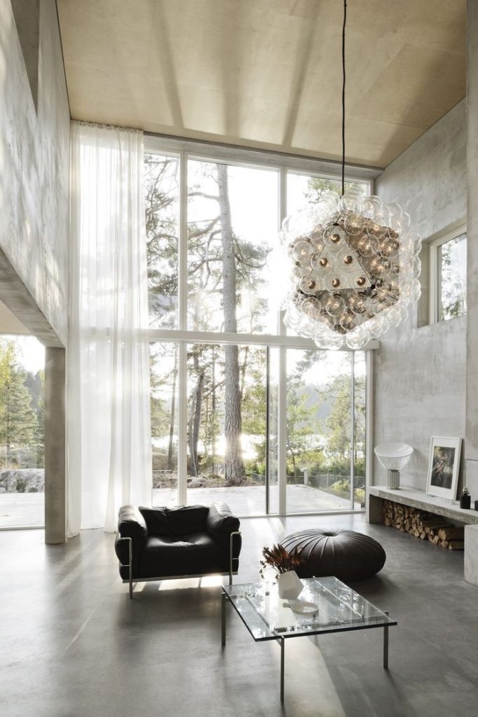
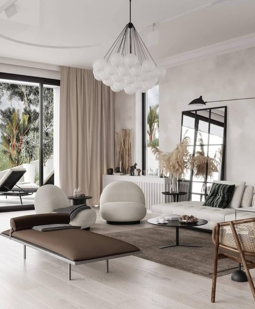
Gone are the days of boring incandescent lights. If we’re making a house that’s going to be considered “art,” only “art” should be allowed inside of it. Enter Interesting, Funky, Modern, Lighting Fixtures/Chandeliers. Here are two examples I feel demonstrate very complementary lighting.
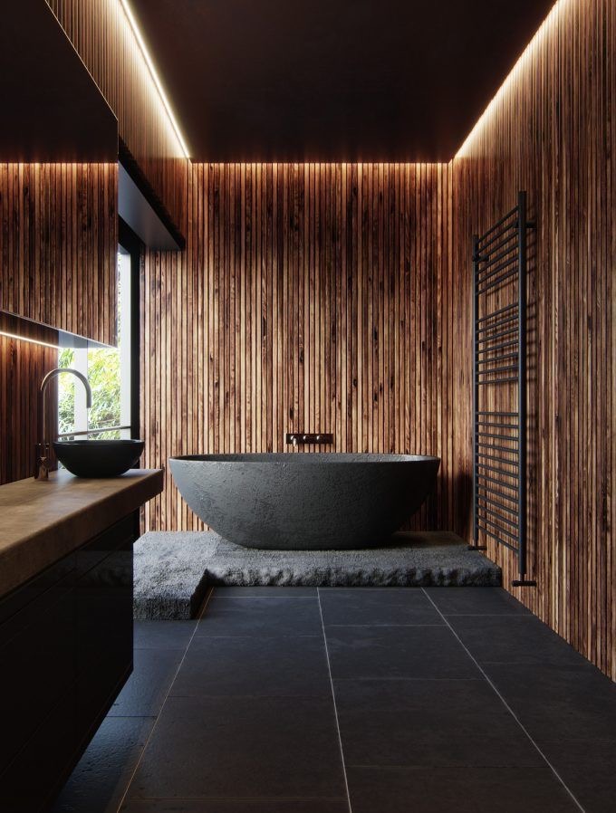
Wood. Yep, wood. The way it’s being used nowadays, as a feature rather than a supporting character, is really impressive. Obviously you need some feature-worthy wood, but go make some “paper” and spend it on some fine wood like this…
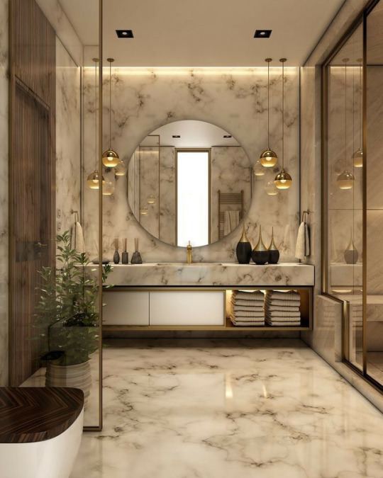
I’m usually not a fan of this next element, but I can appreciate Marble when it’s either used sparingly in accents or just completely over-the-top, as seen below…
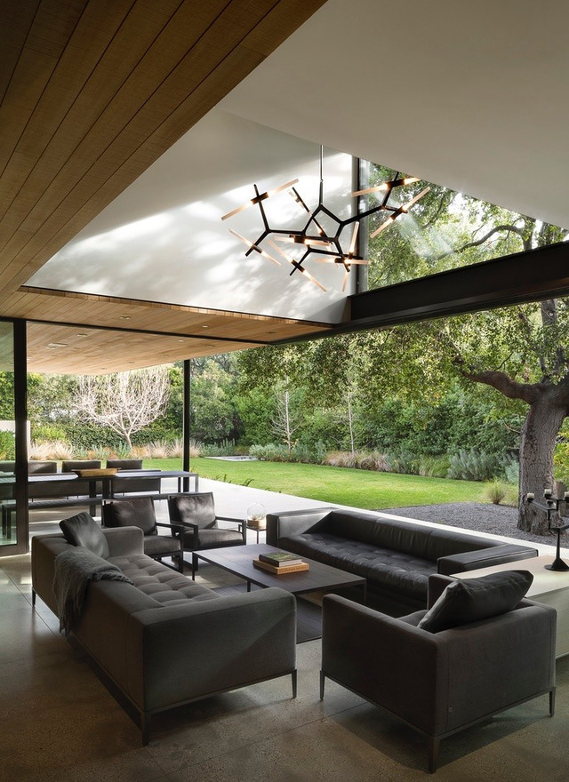
Retractable Walls are exactly what they sound like. Remember that glass sliding door your parents had in their house? This is like that but it’s the entire wall and generally collapses away so you don’t see the doors or framing. In the example below you can see how a living room easily transforms into an indoor/outdoor living space…
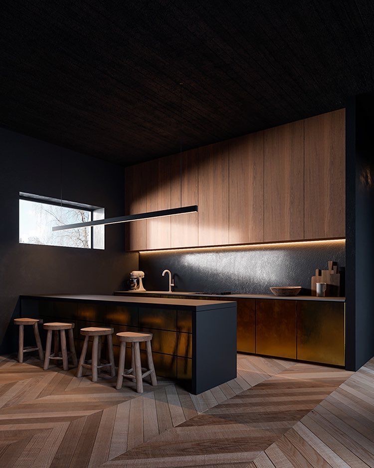
I’ve had a fascination with Herringbone Floors for sometime now… does that make me weird? Honestly, maybe, but that’s neither here nor there. What’s here and there is the killer floor below.
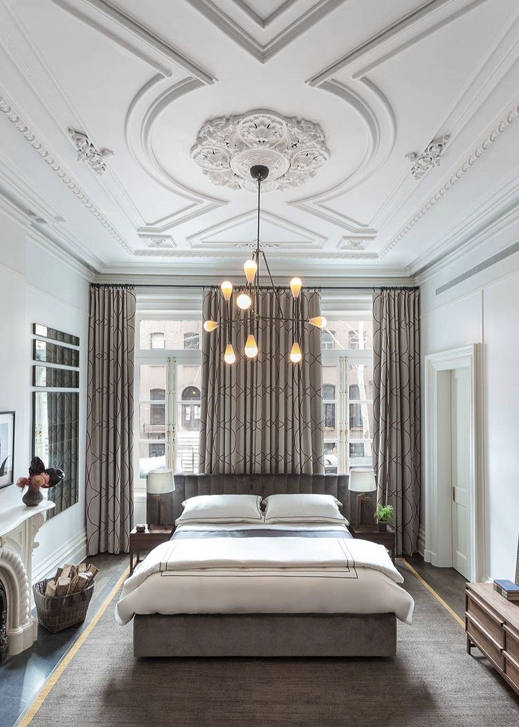
As our penultimate element, I want to talk about something that is usually executed very poorly. Moulding. More specifically Crown and French/Parisian Moulding. Eight times out of ten when I see elaborate moulding, such as below, it’s in the wrong places and not used properly. In my opinion if you’re going to have Parisian Moulding, you need to juxtapose it with something modern or super simple – otherwise it’s going to feel very stuffy… But when it’s done right, it is done very right!
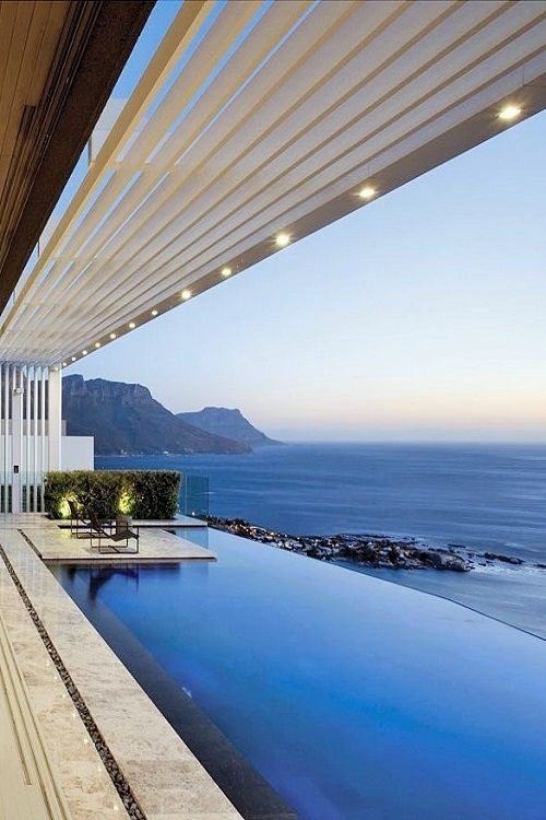
Last but not least, we have to discuss Infinity Pools. Here’s what you need to know about infinity pools, I’ll try to be concise: YES. That’s it, that’s all you need to know. Just do it. Preferably in South Africa with the Cape in the distance, but anywhere else will work as well…
If you haven’t been counting that’s 13, and that’s all we’ve got time for today. I know, it went fast, but honestly when you’re putting together a list of super reasonable and easily accessible design elements that’s just how it goes. I know you’re all going to race out to The Home Depot to get started on these projects, and while I encourage that, I would caution you to consider waiting for my next article on how to put these all together.
Stay tuned and let me know your favorite design element in the comments, or better yet tell me what I missed!
-JM
John is the Vice President here at JohnHart, and as such is responsible for managing and directing the firm towards obtaining its ultimate goals.
He is also one of our main contributors on the Blog. (please see his profile page on the main site for more information.)


